Leslie Glenn Damhus RWA
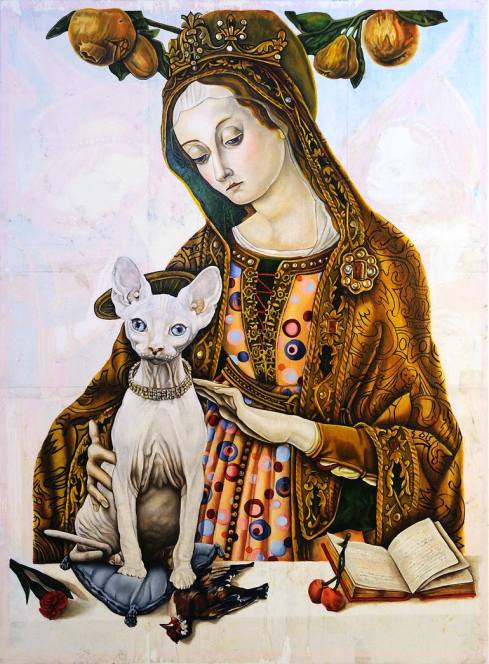
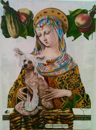
Madonna with Cat
Walking into Leslie Glenn Damhus’ studio, one is immediately confronted by the mid Italian Renaissance. Her work is steeped in religious iconography and she borrows extensively from quattrocento imagery. The attributions of the saints figure largely in her compositions alongside hairless cats and dogs, humming birds and other creatures, fruits and vegetables. As a child she was both attracted to and repelled by the powerful imagery of Hieronymus Bosch’s Garden of Earthly Delights to the extent that looking at it felt like an illicit pleasure. This duality, this exploring of contrasts has become a hallmark of her work. She mixes the sacred and the profane, the serious with the playful, the significant with the trivial.
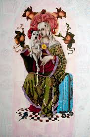
‘Madonna, the Terrier and Suitcase’
2016
Oil on board, 80 x 120cm
Glenn Damhus is something of a magpie gathering images and ideas from many sources, appropriating and reimagining them and then creating collages of these disparate ingredients on her computer. She is passionate about the work of Carlo Crivelli, in particular The Lenti Madonna c.1480. Jacopo di Pontormo is another source. Her work also cites contemporary cultural references, which she inserts into her outwardly serious Renaissance settings with a wry smile.
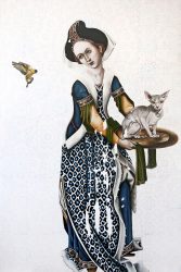
‘Salome with cat and bird’
2017
Oil on board, 80 x 120cm
Her dinner plate halos are a quote from Ronald Lightbown’s monograph on Crivelli where he describes halos as looking like ‘golden plates’. The knitted pussy hats sported by both the Madonna and the cat in Winter 2017, are an obvious Trump reference and appealed to her sense of the ridiculous. Referencing current social and political concerns, she slips in polka dot backgrounds, a gaudy piece of cabin baggage that becomes a seat in Madonna the Terrier and the suitcase and the Hadron Collider which makes an appearance as another halo in the Madonna and chimp Altarpiece.
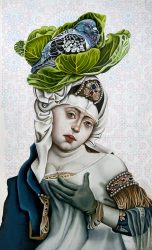
Cabbage and Pigeon
2018
Oil on board, 30 x 50cm
Growing up in the United States, she was introduced to the history of art by her mother, but it was only when she came to the UK and explored the National Gallery’s extensive collection of Crivelli’s, that it became an obsession. She quotes endlessly from his work, taking part of a torso, a headdress or using his sensuous decorative fruits as a motif. Crivelli is an interesting choice in that, although Italian, his very detailed descriptions of nature seem to have an affinity with the works of the Northern Renaissance.
Leslie’s love of fabrics is another gift from her mother who was a superb seamstress. She notes that the clothes in Renaissance paintings were contemporary in their time and that she is merely following the lead of those masters in giving her paintings a contemporary slant. Many religious Renaissance paintings were also not quite what they seemed, another dichotomy echoed by Glenn Damhus. They were frequently an excuse for the celebration of female beauty for the delight of the patrons who commissioned them they also celebrated the wealth and status of those rich nobles and wealthy merchants.
Leslie’s historical ‘quotes’ are selective and sit alongside contemporary edgy comments on the nature of representational art, portraiture, politics and the human condition. Her faces are those of twenty first century women and she frequently uses her own eyes. She is not afraid to shock. For her degree show at UWE she painted a large altarpiece of the Madonna but instead of a child she holds in her arms a naked monkey. She says that she was not being deliberately provocative although she was delighted that her work was seen as controversial. Shown at the Black Swan Open in Frome the following year a deputation requested that the painting be removed from the show. However in a subsequent panel discussion it transpired that some of those objecting had not actually seen the work and once they became aware that this was not a blasphemous representation of the Virgin Mary they rescinded their objections.
Madonna and dog
Glenn Damhus’ process is intriguing. Following her initial research and the creation of a visual collage on her computer, she lays down a printed background. Then she works in oils on board using tiny brushes. Church altarpieces were usually painted in tempera on board and it is a surface that perfectly suits her way of working. Her printed under-painting is often damaged in the process of laying it down referencing the way in which parts of frescoes peel away as they gradually disintegrate. This deliberate seceding of control over the surface avoids the danger of perfection. Again it becomes apparent that nothing is quite what it seems. The huge disparity in the scale of her work and the size of her brushes, the search for perfection versus the embracing of serendipity all point to her fascination with contrasts.
© Fiona Robinson 2018
Article originally published in Evolver Magazine
Lucy Austin

Imagination is the crucial component in Lucy Austin’s drawings. Without that they would lack something vital. She plunders her imagination to the create lines, the shapes, the colours, the layers, which have a conversation with each other that sings.

Tender Machines, Jelly
Watercolour on paper
120 x 100
What feeds her imagination is her daily life. The walk home from the studio through an urban landscape, the packaging she collects, the beachcombings. The random small objects that catch her eye, the marks and detritus that litter the world and the sights and sounds that surround her. Structures like electricity pylons, windmills, ladders and spiral stairs and the vacuum cleaner which references not just the cleaning of a domestic interior but the cleaning out of the body’s internal organs too. It is as much an emotional landscape as a physical one which is her resource.

Flip Flop
Watercolour on paper
28 x 38 cm
Lucy draws with colour and a brush. No pencil preparation, no advance plan other than perhaps a ground of colour. It is intuitive and what emerges through her innate sense of composition is a complex composite of layering of shapes, marks, lines and colour which have a concrete meaning. They are something, they may touch on a narrative but they are not abstract in the pure sense of the word. Through their spatiality they have a three- dimensionality which negates the need for physical three dimensions.

A machine for cleaning my house
14 x 19 cm
framed
(This drawing was selected for The Jerwood Drawing Prize 2010.)
Words fuel her imagination too. She reads fiction voraciously and loves the pure clarity of writers like William Trevor. Poetry too: the phrase, shabby equipment always deteriorating, from T.S. Elliot’s poem in The Four Quartets, East Coker was the beginning of her Tender Machines drawings. She collects words for their sounds, their meanings and their shapes writing them on her studio wall. She is playing with them but it is a serious business and they may be future titles. She feels she has a responsibility to title her work, for her viewers and herself and also for the work. They are sometimes explanatory, triggered by the finished piece, a clue or a way into her thinking and at other times titles just are, for no particular reason.

“Work in Progress: new series of prints this year. The silk-screen prints are printed on 300gsm Saunders Waterford paper and are in small editions up to a maximum of 12. The prints all have deckle edges and are printed in seven colours each.”
Lucy Austin was a Cheltenham Fellow in printmaking and has made three-dimensional work although these were not sculptures, rather three-dimensional drawings. Now she makes drawings in a combination of watercolour and gouache; she uses acrylics in preference to oil paints, partly because she doesn’t like the smell. Artists who are touchstones for her are Louise Bourgeois, Prunella Clough and Phyllida Barlow.
 Black plastic cable ties
8 x 9 x 10 ft
Drawing is her practice despite the ubiquity of colour. They identify themselves as such primarily through their use of a fluid line. However she has recently returned to printmaking after quite a long gap and is making screen-prints, experimenting with her signature layering. Using acrylics with a printmaking medium she is able to vary the translucency and opacity of the colour in a similar way to that achieved in her use of watercolour and gouache.

Duologue Still Life 1
watercolour on paper
38 x 48 cm
Austin works slowly but fast which seems like a contradiction in terms. She produces a large number of works in any one series. Her watercolour brush drawings rely on speed of execution and sureness of touch; hesitancy would kill them, and. Temperature is crucial too. In the summers heat the colour dries too quickly in the gap between the loading of colour and the execution. In the winter the opposite is true ad the process is too slow. So the speed is in the physical doing and the slowness exists in the endless trials where nothing is certain, nothing is finished and complete until she is completely satisfied with what she sees. The thinking time and the consideration and re-consideration of where one shape, one colour, one set of lines will cross, layer, sit alongside or on top of another, and then the colour adds another dimension. It is a very long process, which leads to the completion of a body of work within which each work is resolved, satisfying and completes a circle. Each individual work only exists because of the ones that went before.
Lucy’s work can be seen in the The Sunday Times Watercolour Competition 2016,Guildford House Gallery, Guildford
Sat 10 Dec – 28 Jan 2017
Cover Image
Duologue 1
28 x 38 cm
(Sunday Times Watercolour 2016)
© Fiona Robinson 2016
This is an edited version of an article originally published in Evolver Magazine, Sept – Oct 2016
Jim Hunter

Travel has had both a formative and an enduring influence on Jim Hunter’s practice. Sense of place, in terms of location, as well as in the positioning of shapes on a surface are important concerns. As a student at the Royal College in the seventies he was awarded a bursary to study in Paris. Following in the footsteps of so many young artists who migrated to that city to paint, he spent four months working in a studio in the Cité des Arts absorbing the culture and the ambiance of Paris.
In 2007 Hunter was granted a three-month sabbatical from his job as Head of Art at the University of the Arts Bournemouth. He chose to go to Venice, a place which is “a metaphor for painting: all surface, depth of surface and reflections”. There, he made dozens of little sketchbook studies. These fleeting images floating across pages of translucent water-colour are punctuated with ink lines which run and smudge leaving a beautiful unexpected residue of liquid marks. The addition of collage using the paint-splattered newspaper protecting his working surface placed these little drawings firmly in the present moment. Snippets of text, images and spilled paint preserve the randomness and unplanned nature of these pieces.

Sketchbook studies on Hunter’s studio wall
Architecture as well as landscape interests Hunter and many of his studies contain images of arches and pillars, “openings which are like looking at and looking through a window”. He uses an archway as an excuse to play around with perception. Both the Matisse Chapel at Vence near Nice and the magnificent cathedral at Aix en Provence have been sources of inspiration.


Venice, the city that attracted Ruskin and Turner, proved to be the catalyst that changed his practice and it was the start of making large work on paper. However it is Hydra, an island off mainland Greece, a place that immediately resonated with him, which is the focus of an exhibition at the Slade Centre in Gillingham. On Hydra, Hunter was entranced by the shifting shapes on the water, observed from the balcony of his apartment overlooking the bay.

Large Harbour, Acrylic and watercolour on paper, 81 x 135cm. 2015
He filled three sketchbooks in as many weeks. It was through his process that he established a connection between these two islands, engulfed by water and full of flickering light. There is a slow progression from small drawing, through collage, exploration of shape and colour, to large paintings. Hunter’ s use of colour is unerring; vibrant and intensely clear it nevertheless retains its subtlety. Initially related to the original motif, the changing hues become part of the developing abstraction whilst retaining a relationship to their starting point, the artist’s experience of place.

Hydra – Black and Violet Watercolour, Acrylic and Collage on Paper 96 x 96 cm 2014 
Hunter listens to Contemporary Jazz and he identifies close links between the elements of improvisation inherent in both music and painting. He draws parallels between the way he uses colour, in particular the floating and layering of shapes, and the composing of music. He finds that paper as a support leaves an image seductively open to interpretation. On paper, a painting has the potential to be continued, to be taken to another state, it allows a pause for reflection. There is perhaps a suggestion of waiting, a sense of a continuing beginning rather than the closing in of an end. The white space both within the image and surrounding it creates a dialogue, a feeling that there is a conversation here that is ongoing and could be continued the next day.

Acrylic and watercolour on paper 80 x 135 cm 2015
© Fiona Robinson 2015
Feature published in Evolver 90 November and December 2015
Header Image Hydra to Neokosmidis, Acrylic watercolour and collage on paper, 96 x 96cm. 2015
Jim Hunter’s exhibition of new paintings ‘PLACES’ is at The Slade Centre, Gillingham, 10 October to 8 November 2015 www.sladecentre.com
Andrew Muñoz
Painter Andrew Muñoz has a particular vision expressed in paintings that are often dark and disturbing. He touches on areas of human life that many would rather not confront but he does so in a way that draws you in, it is a darkness tinged with beauty. Subtle, beautifully modulated colour gives the work an eerie unearthly quality and a peculiar charm as his palette changes, as he moves from one body of work to another, complementing his sure handling of paint. He is influenced by William Sasnal, who uses a similarly restrained palette and by Peter Doig.
He has an obsession with the photographs of Diane Arbus whose strange portraits of deviant or marginal people made them so distinctive. One of her best known images is Identical Twins, Roselle, New Jersey, 1967 which has referenced. Working from photographs, his own and images from newspapers and magazines, he often deals with outsiders, those who drop through the cracks into the unsafe places in society. “Part of the work is about the photography as a subject.” Arbus committed suicide in 1971 and the themes of suicide or people who are excluded through illness or mental health problems frequently recur in Muñoz’ paintings.

Las Gemelas 2008 oil on board 36x22cms
There is a duality at the core of Muñoz’ compositions, abstraction versus representation, figures that are human and animal, man and woman. His extensive reading of Myths and Legends from many different cultures is another strand that contributes to his narrative. He has also invented his own dark mythology, initially as storytelling for his two young children and then as the tales became darker and unsuitable for children, purely to accompany the work. Figures are often isolated in bleak landscapes reflecting the inner isolation acquired as a safely mechanism by people who are fearful of confrontation with the everyday in our modern fast paced unforgiving world.

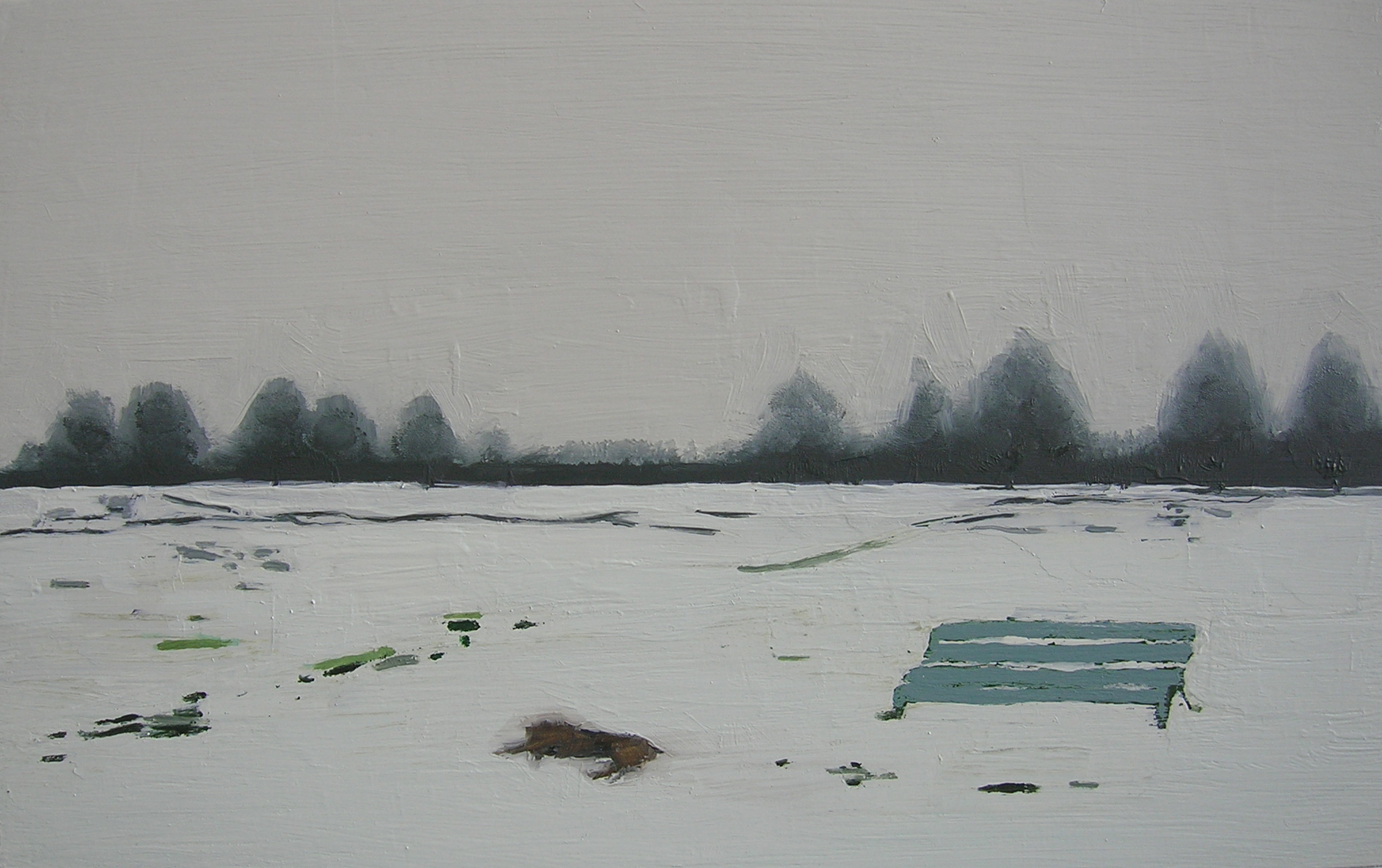
Hymnologist 2013 oil on board 32x33cms
The body of work, which he reluctantly calls his picture book paintings, new title pending, use predominantly primary colours. Their subject matter is childhood imagination, children’s books and to an extent they are autobiographical. His later work moves on to cautionary tales, the colours becoming more natural, developing into the green paintings, often set in woods or parks but usually empty desolate places. For Muñoz parks and children’s playgrounds are unhappy, lonely places frequently associated with memories of his solitary childhood. Park benches, a frequent motif, appeal to him as formal elements of composition but they are also immensely poignant. The Victorian concept of memorials to the dead encapsulated in a structure, set in a park where people can sit and look across a vista once the province of the deceased. Muñoz finds this idea extremely sad as the untended bench gradually rots and falls apart replicating the disappearance of the dead.

The Bather 2013 oil on canvas 100x67cms
Muñoz’ current work Devolvers is a natural development from the earlier work and here the palette seems a little more aggressive but again containing those beautifully modulated gradations of colour which are characteristic of his work. His interest in anthropomorphism has been discarded in favour of an interest in grubs. He combs the shore side for strange objects hidden in mud and sand, visceral things which reference evolution and memories of primordial creatures dragging themselves out of the sea and up the beach. His figures are in a process of reinventing themselves creating a different version of their personality and his environments are becoming the mud and sand of coastal areas. The formal constituents of the park bench are being replaced by the looping rhythms of the struts and girders of the Severn Bridge. But ultimately, Muñoz states, “Ideas and philosophy are only a part of it. It is about paint and materials and what happens when you put a blob of paint on a canvas.”

Installation shot at the RWA Bristol
© Fiona Robinson 2015
Published in Evolver May June 2015
Header Image: Andrew Muñoz Dead dog 2010 Oil on board 36×22 cms
Andrew Muñoz is currently showing work in the link space at the Royal West of England Academy Bristol until 15 May 2015.
A new book ‘Andrew Munoz: Selected Paintings 2007 – 2014 is now available on Amazon
Stewart Geddes

It would appear that Stewart Geddes’ abstract paintings have little to do with landscape. However the urban landscape, the rural and the cubist motifs of cube circle and triangle are deeply embedded in his work. Just out of art school Geddes pursued a successful career making painterly Plein Air landscapes. However the subject palled and as he looked at the abstract flattening of the picture plane in Lanyon and Alfred Wallis, and the way the same motif in Lanyon became a signifier of multiple meanings, the importance of Lanyon’s paintings became, ‘not a copy of a view but a painting of an experience’. In a revelatory moment Geddes reconnected with the cubists, and moved into abstraction.
Living in London his source material was the urban landscape with occasional forays into the Dorset countryside where the original beach huts near Portland Bill, before gentrification, yielded rich pickings. His subject was rooted in the concept of The Modern Ruin, ‘something by which you can experience the remoteness of your childhood’. Buildings which had existed for barely fifty years and which when constructed ‘were the last word in newness’ were now undergoing demolition, offering views of broken interiors, collapse, deterioration and destruction. The bleeding walls of peeling wallpaper in torn rooms represented the memories of lives lived in those spaces and were frequently a cue for a yearning for the irretrievable. For Geddes, an object in the process of breakdown attains a new meaning and he replicates this natural or human-precipitated process in his work. A constant cycle of addition and reduction, degrading the surface, tearing, scraping, the addition of colour, collage or mark-making which is then subjected to further degradation.

Shippen. Oil on panel, 30 x 23 cm
He subscribes to Picasso’s maxim that making art is a process of ‘not seeking but finding’. A statement that relates to Stewart’s methodology and to the ‘the found painting’ as an object which has become increasingly central to his practice. He does not seek them out, it is almost as if these ready-mades find him. He relishes the moment when a change in orientation decontextualises an object leaving it devoid of its utilitarian function, ‘yet liberates it to hold a simultaneity of meanings’. Then comes the delayed realisation that it is actually what you originally thought it was. Hob is a decommissioned cooker hob, with the look of a ‘60s spirograph drawing, but re-positioned, hanging in a domestic interior its faded damaged surface attains poignancy.

Hob. Ceramic cooker hob, 49 x 44 cm
It was Matisses’s paintings from his most cubist phase around 1910 that stirred in Geddes an interest in collage, further fuelled by the research he did for his M.Phil at the Royal College of Art into the French Décollagist group, in particular, the work of Jacques Villeglé and Raymond Hains. Geddes’ approach is constructivist and the build up of collage, mark and paint has an affinity with the idea of layers of history. His method relates to his view that time is being held on the surface.
His paintings are improvisations, not in a musical sense with that swiftness of change generated through performance, but rather spread out over a long period. They stretch out time because the processes are so slow. The improvisation occurs through the use of a visual language that gradually emerges through the experience of a generic landscape, acquired via the constant exposure to and absorption of the urban terrain. He gathers information through photography, the act of a moment, rather than drawing, which takes longer and which he sees as ‘a physical, empathetic performative act’. His palette is observed, coming from his constant garnering of images whilst walking through the streets of Bristol with a camera, recording buildings, hoardings, graffiti. He values the city for its amalgamation of the urban the pastoral and the maritime.
By a process of subtraction and editing Geddes filters out and discards the unimportant areas of a painting. His curved edges are informed by the ipod aesthetic as well as the notion of children’s round-edged school slates on which they would draw or write in chalk. More recently, only the tops of the paintings are rounded revealing his desire for a greater sense of stability. His process is methodical, organisation followed by disorganisation, followed by application and subtraction that “is nudged into a form of resolution, which is found through the negotiation with the process.” His motifs continue to be the circle the square and the triangle which can be linear, solid, manipulated, broken, echoed and repeated ultimately achieving multiple meanings.

Keskeys. Acrylic on panel, 30 x 39 cm

Chandos. Acrylic on panel, 46 x 60 cm
Header Image: Polyphant, Acrylic on panel, 30 x 23 cm
Stewart Geddes Feature published simultaneously in Evolver 86 March and April 2015
© Fiona Robinson 2015
Tania Kovats – Oceans – at Hestercombe House
I must go down to the seas again, for the call of the running tide
Is a wild call and a clear call that may not be denied;*
The siren call of the sea has a willing captive in Tania Kovats. Water has been a recurring theme in her work. There has been an inevitable progression from Meadow, the transportation of a wild flower meadow from Bath to London via the inland waterways, to Rivers, a collection of water from 100 rivers from around the uk, to collecting sea-water from around the globe. Breaking boundaries, connecting territories, bringing the outside in, Oceans transports the sea into the confines of Hestercombe House and contains it still further in bottles.
Walking up the main driveway towards the grandeur of this stately house, an array of windows are partially masked by blinds, marked by lozenge shapes that evoke the still waters of a calm sea. Marks which are repeated inside the house in Sea Mark a technically challenging wall installation of ceramic tiles and in Sea Mark for Hestercombe a vast site specific installation of small ink drawings which paper the walls of the stairwell fusing with the fabric of the building. Glass and water pervade the spaces. Looking out from the first floor, the transparency of these components, the liquid and the vitrified, are repeated in the straight Palladian waterways of the garden designed by Gertrude Jekyll and Sir Edwyn Lutyens. The clear glass of the magnificent windows confines the interior, outside the clear water contained in the rigid arrangement of channels mirrors clouded skies. But water will not always be contained.
The human body is made up of around sixty percent water, it is the connective medium that flows through and lubricates the different parts of this complex mechanism. Great Britain, this country in which we live, is surrounded by sea, it is an island whose interior land is connected and divided by arteries and veins of water. Kovats is interested in water as a conduit and in its relationship to time. Her concerns are landscape, seascape, movement through the land on water, experiences which encapsulate the slow unfolding of time, a progression that slows time, that offers a breathing space away from the hectic noisy speed-dating with life that goes on in urban spaces. And yet water, our seas and rivers can be violent treacherous fast moving and tumultuously noisy. Canals our inland waterways are slower moving but they too can flood and invade our landlocked territories.

Tania Kovats All the Sea (2012–14), Courtesy the artist. Photo: Ruth Clark (Image at the Fruitmarket Gallery Edinburgh)
As with Rivers, the installation, All the Sea was a way of stilling water, arresting its movement. In drawing in waters from all the seas around the world, it effectively drew in people from all the lands that bordered those oceans. It became a huge, collaborative artwork. Her call to people to send her samples of water from the seas where they lived had an astounding response and people from all over the world sent her bottles that contained seawater together with histories, anecdotes, information, all of which data has been archived. But the water itself has been filtered and transferred into glass bottles of different shapes and sizes containing different amounts of water and displayed on an enormous open plan shelf.

Tania Kovats, Only Blue (Antarctica), 2013. Courtesy the artist.
Empty bottles signify the missing seas. The pages of books of maps piled on tables, in which the land has been whited out, are a poignant reminder of the falsifying of records, the airbrushing of inconvenient cultures by early cartographers. Salt drawings, experimenting with speeding up the process of evaporation to leave increasing levels of crusted salty residue, are a memory of the water that was there.
Kovats has captured the sea, making something permanent out of something fluid and ungraspable unless trapped in an impermeable container. She has divorced these waters from their histories, containing them in an alien environment but, filtered, not distilled, they still hold the memory of their origins and represent a moment in time, a moment of time in the history of their captor. She has stilled the perpetual motion of these tiny samples of the world’s seas.

Tania Kovats All the Sea (2012–14), (detail) Courtesy the artist. Photo: Ruth Clark
© Fiona Robinson 2014
Originally published in Evolver Issue
Tania Kovats Oceans at Hestercombe, curated by Tim Martin from the original exhibition at the Fruitmarket Gallery in Edinburgh continues until 11 January 2015.
* From Sea Fever by John Masefield
Ian Middleton

Ian Middleton’s sculpture is passionate, sometimes angry and often humorous. It is certainly not indifferent. As a self-confessed ‘media junkie’, he works from observation taking themes from current affairs, religion and environmental issues, using found objects to stimulate his visual ideas. However, he says, ‘the work is not constrained by these forces but is free to evolve independently while maintaining the intensity of its origins.’

Take Away Bronze 33h x 51cms
The view from Middleton’s studio is breathtaking: a parceled landscape rolling out across the valley up towards the hills above Lyme Regis. Below, his garden is filled with sculpture: stacked white cement pillows, a meerkat in typical stance surveying the vegetable patch, a Parthenon horse’s head guarding the terrace. His workshop is crammed with objects, tools, working materials. Molds queue up on the floor; a scatter of bronze long-necked chicken heads litter the bench waiting to be released from the residue of the casting process and a plastic giraffe sits incongruously in a boat.
Growing up in the flat Fenlands of Cambridgeshire, he early on, became aware of the big skies and low horizons, which silhouetted everything against a pale background distorting perspective and scale. That perception of scale has stayed with him and is central to his arrangement of objects. As a child he visited Ely Cathedral, that magnificent English Perpendicular structure reaching up endlessly and impossibly to the heavens. In the Lady Chapel, he came across stone statues, their heads severed and faces battered in a shocking act of desecration by Cromwell’s men. It gave him a lifelong distrust and dislike of religion, feelings that came to the fore again with the destruction of the Bamiyan Buddhas in Afghanistan in 2001.

Mayfly Bronze, 17h x 34cms
Middleton’s sculpture is figurative. He casts found objects and constructed pieces, often in multiples, assembling them into strange hybrids, which play with scale and question stability, real and metaphorical. His work is process based, time consuming and technically challenging, reference the casting of the boat into the bronze surface in Mayfly so that it floats across the cover of the book. Rough visual notes give way to process and response to materials once the making is under way, or ‘I may try things out in wax, and different elements come and go as the dialogue evolves.’ His is an art of juxtaposition, sometimes of serendipity: a gathering together of apparently disparate things, which suggest associations, which topple preconceptions and ask questions of the viewer. An art of change and experimentation, of random couplings and risk takings which bring to mind the Surrealist sense of dislocation typified by Lautréament’s often quoted line ‘beautiful as the chance meeting on a dissecting-table of a sewing-machine and an umbrella!’ His work is critical of politics or religion but never proselytizing, didactic or polemical. Alternative scenarios for serious issues are often mediated through humour.

Tea Party Bronze, 35h x 32cms
Constantly re-inventing his own sculpture and refining his ideas Middleton challenges people to step out of their comfort zones. The distortion of scale where boats and apples, buildings and books occupy the same space is deeply unsettling. In Mainline a skyscraper, emblem of capitalism or financial crisis, sits impossibly on soft pillows. In Tea Party, a response to the American gun lobby’s intractable attitude following the Sandy Hook massacre of twenty children and six teachers, a large tea urn floats on supplicating tiny hands. Only a couple of these little fingers are holding up this large unwieldy object, such a simple way to say something quite profound. Middleton’s iconography is idiosyncratic and original, and open to interpretation. There is something grotesque and suffocating about an apparently innocent plaster Madonna cast in bronze and gagged or maybe saved from toxicity by a tiny gas mask. Cast bath-toy ducks with targets tattooed into their sides swim along the top of a full size ciment fondu mattress or perch on top of a pile of bronze egg-boxes.

Pot Luck Bronze 35cms high
Experiencing Ian Middleton’s sculpture is destabilising. World-views shift, certainties are just out of reach. Weightlessness is suddenly synonymous with bronze. His ideas are illusive; they require and repay the time spent on them. He plays with viewers’ perceptions on many levels making them repeatedly adjust their idea of what they are looking at; nothing is quite as it seems. His art is one of impossibilities and improbabilities, at each glance it presents a different front. No surprise that he sees things in the round and is always interested in what is going on behind the object in front of him.
© Fiona Robinson 2014
Header Image Figure in a Landscape Bronze, 44x27cms.
Article originally published in [Evolver] 81 May/June 2014
Phyllida Barlow ‘Gig’ at Hauser and Wirth Somerset

Like Alice in Wonderland, Phyllida Barlow’s installations fill the spaces of the new galleries at Hauser and Wirth Somerset, but unlike Alice, Barlow has no desire to use a magic potion to reduce their size. She wants their heads to touch the ceiling, she wants to take them beyond human scale. Her sculptures have taken possession of these interconnecting areas so that we as humans have to negotiate the space remaining to us. Barlow’s work is often concerned with the negotiation of physical things in an urban environment. Here, in this rural context, it is not the object which is trapped, it is the space which is left fighting for breath, hardly able to move. She confronts the assumption that one should be able to wander at will in the countryside. Her premise is that the Arcadian idyll no longer exists and that the land is now an exclusion zone, humanized and proscribed. Farming is more factory than the great outdoors. The romantic ideal of landscape, observed from a distance in all its majestic beauty, a silent black and white photograph of an experience, has perished. It is a figment that comforts those suffering the toxic fumes of the big city. This Somerset location has elicited a response that highlights the ambiguities of how we live our lives and the awkwardness of the gap between what the reality is and what is in our imagination.

Gig. 2014
Hauser and Wirth Somerset is a stunning conversion of former farm buildings into a gallery complex which is sympathetic to its rural location. But with this spectacular opening show these galleries, play second fiddle to Phyllida Barlow. On entering the first room you are assaulted by a cacophonous riot of joyous colour and texture: giant pompoms in all those celebratory fabrics in glorious gorgeous hues. Weaving through these hanging objects, which impede your progress, prepares you in a funny way for what is to come. It is akin to the summer blindness of coming indoors out of bright sunlight.

untitled: grinder. 2014
By the time you move into the Workshop Gallery your spatial awareness has been tampered with you are more prepared to skirt around the edge of a work constructed, ceiling-height from studio detritus and plywood. Next, entering the Pigsty we come to Untitled: grinder. It is both voluptuous and aggressive, its seductive curves draw you in and then you become aware of its spikiness, its voracious appetite for nastiness. This encapsulates the countryside’s beauty and the beast dual personality. The Main Gallery contains the least available space as huge rough-hewn planks launch themselves upwards, guarding their enclosure, excluding intruders as successfully as any razor-wire fence. Despite their massive scale, a scale gifted them by the size of the space – it is all about relativity – these sculptures, these installations, deny any sense of monumentality. They are impermanent and will have to be dismantled at the end of the show.

untitled: postscorral. 2014
In translating the negotiation of objects in an environment into sculpture, which has to be negotiated in the same way, Barlow creates a situation where her work cannot be marginalised, it is impossible to slip past without engaging with it. It confronts you, as determinedly as someone who stands directly in your path and will not step aside to let you pass. Not for her a celebration of the minimalist white cube, its pristine surfaces adorned with polite work constrained by frames. In a magnificent way Phyllida Barlow has temporarily upstaged these new galleries and their white walls will have to await their moment in the sun! However if this challenging exhibition is a measure of Hauser and Wirth Somerset’s intended programming it will be a superb addition to the cultural landscape of the South West.
© Fiona Robinson 2014
Article first published in [EVOLVER] 83, September / October 2014
Phyllida Barlow ‘Gig’ at Hauser and Wirth Somerset Until 2 November 2014.
Header Image: untitled: holder, 2014
John Eaves

Red Growth. 2012. Watercolour
It is often the small, apparently inconsequential things that give the clue to what concerns an artist. Pinned to the wall in John Eaves’ studio is a group of found objects: a flattened toad, a tiny bat corpse, an elongated frog, its legs dangling, and a couple of pieces of rusted metal. The metal pieces are strangely angled, cut-off geometric shapes. A random arrangement perhaps, added to in an ad hoc way but it is intuitively composed, the rich orange redness of the rust reveals how attuned Eaves is to colour and each component of this small installation has a autonomous existence which connects it to its fellow objects.

Rocks Cornwall. 1989. Watercolour
His work is fed by an empathy with landscape and the natural world. It is the structure that attracts him, the strata of rocks and the organization of form. He draws outside making close observational studies, but returns to the studio to refine his ideas. He abstracts from remembered and observed experience of place, deconstructs the geometry and then the shapes are manipulated, reconsidered, taken apart and reconstructed into beautiful abstractions that are in the nature of improvisations. As a musician, his instrument is jazz flute, improvisation is his modus operandi and although he does not work from it directly, ‘you can’t force connections’, music runs parallel with his art. He cites Cezanne’s structure as an important influence and having recently seen footage at Tate Modern of Matisse cutting large sheets of paper for his collages he was fascinated by his speed and accuracy. Awarded a Leverhulme Emeritus Fellowship to research Emil Nolde in the 1980s his attachment to Nolde’s fluid colours and swift execution has stayed with him.

Eaves is renowned for his use of colour: deep luscious ultramarine, inherited from those rich tones of lapis lazuli used for the Madonna’s cloak in Quattrocento altarpieces; jewel-like shifting tones of reds and yellow-oranges, pinks and purples line up next to each other in his work. From the experience of the landscapes through which he moves, vibrant intense shades emerge subliminally, their purity distilled from those touches of brightness barely glimpsed in the open mouth of a tiny orchid petal, the red of a wild strawberry or the reflection of sky on sun-lit water. Such tints, hugely expanded and glowing find their way into his powerful large paintings where they sing with joyous, pitch-perfect colour. In his collages the paper is cut, hard-edged at one point, then torn creating a rhythm of contrasting edges and vibrating hues. His materials are sourced from endless boxes of papers saturated in watercolour, which he mixes from dried pigment and stores in glass jars. For his painterly prints he preps his plate and often prepares his paper with swathes of colour before heading off to 107 Workshop to print.

Towards the Centre. 2010. Oil on canvas
Links and connections are what currently concern Eaves and in lieu of another retrospective, he had one five years ago, he is putting together an exhibition for the autumn, which will consist of small works. Drawings and landscape studies in crayon and watercolour, ‘litho chalk is lovely to draw with’, will be seen together with small oils on canvas in his signature abstract slashing compositions. A gift to those who will revel in seeing the clarity of his thought processes and the way in which he naturally moves from surface to surface, medium to medium and develops his themes, never repeating the same motif, but investigating each one until it reaches its natural conclusion before offering a way forward into the next work.

Quarry Stone. 1985 Gouache.
© Fiona Robinson, 2014
Article originally published in [Evolver] July/August 2014
John Eaves: Small Beginnings. 6 September – 23 November 2014
Victoria Art Gallery Bath.
John Eaves, Paintings and Prints since 1976. 8 – 20 November 2014. Anthony Hepworth Fine Art, Bath
Discovering exciting artists new to Dorset Art Weeks
Dorset Art Weeks 2014

Katie Shepherd Encounter with a Crow. Animation
Dorset Art Weeks 2014 launched with a great deal of razzamatazz at Sculpture by the Lakes on May 23rd. Costumed stilt walkers, jugglers and a brass band welcomed visitors to the Quick Draw Event. The first day of DAW was memorable for its downpours and then the sun came out as I set out to explore a selection of 285 venues, 1000+ artists work, make exciting new discoveries and revisit familiar friends. There were powerful and impressive prints from every period of Brian Rice’s outstanding career; immensely time consuming jems of tapestries by Jacy Wall; new painting in a darker palette by Gerry Dudgeon alongside his beautiful drawings; and ethereal and atmospheric photographs by Jill Kennington Courtauld. At The Courtyard Gallery and Workshop, Simon Pirie’s round dining table in English walnut, was clearly the star of the show but the refined elegance of the Rosa Dressing Table quietly shone. Jim Hunter’s watercolor and collage paintings are responses to India, France and the Purbecks. These deconstructed landscapes abstracted into their essential forms revealed an intuitive fluency, the result of working swiftly and surely, direct from the subject.

Jim Hunter Red Fort. Acylic and watercolour, 83 x 84cm.
 Katy Shepherd Crow Animation
Painter and film-maker Katy Shepherd has recently returned to a painstakingly slow, old-fashioned hand-drawn process to make her evocative animations of a Tasmanian Wolf, a Dodo and her poignant Crow, its wings slowly starting to move after being knocked off a roof by seagulls. Her animated figure rubbing itself out then being redrawn over smudged charcoal amidst bits of eraser and torn masking tape, encapsulates her process. Tucked away behind a suburban house front in Dorchester a real treasure was to be found in the exquisite pencil drawings of Rodney Hubbuck, many of them dating back to the seventies. His subtle, meticulous work is done from memory. Flying buttresses, stone-walls, churches and manicured topiary set in imaginary landscapes with an occasional figure to give a sense of scale. You enter the world of Rodney Hubbuck’s imagination, experience his almost Betjemanian sense of humour and find a mysterious other-worldliness.

Rodney Hubbuck

The number of artists communicating their enthusiasm and actively demonstrating how they make their art was one of the highlights of DAW 2014. Printmaker Ruth Ander was rolling luscious shades of oil paint onto Perspex to make her subtle mono-prints on fine Japanese tissue. Ceramicist David Walker had just taken one of his dramatic hand-built raku pots out of the kiln and was picking off bits of burnt glaze to reveal the cracked lines underneath and in Bridport, designer/maker Jack Draper explained how he used ammonia to achieve the rich tones on his simple but beautifully stylish fumed-oak desk. Painter and sculptor Mike Chapman shared his thoughts on his relationship with carving, the need to have a conversation with his materials, to wait for them to give something to you, so that working with them is a collaborative effort between artist and stone.

Ruth Ander

Jack Draper
Near Blandford I stumbled upon Jo Burnell’s charming decorated pottery. Fish, flowers, stick-leg strutting cockerels and bashful hens, were busy dancing across the surface of jugs, mugs and bowls. The Hedgecocks, father Anthony and daughter Aisling had filled the garden and studio with sculpture and drawings. Lurking in a far corner of the garden was Anthony’s Guardian, in steel, parts of it extracted directly from the crusher and used as found, imparting a vulnerable quality akin to folded paper. In the studio, After Boccioni, his small bronze homage to Boccioni’s Unique Forms of Continuity in Space, strode purposefully into the future accompanied by Aisling’s sculpture using painted steel and polystyrene beads. Filling the whole of the end wall Aisling’s immensely complex layered pencil drawing We Are Stardust, defied the conventional limits of her medium.

Anthony Hedgecock and Aisling Hedgecock
Near Lyme Regis Duff Pearce was showing linocuts with collaged cut and pieced shapes in strong reds and blacks. Jane Hedges lyrical geometric paintings are landscape based but had strong suggestions of Islamic pattern making and Ian Middleton’s latest work is intriguing with beautiful colouring emerging in the patination of the bronze. In drawings variously using ink, collage and photography David Smith explores the interplay between chaos and control and has set himself a project, Letter 365, making a drawing a day for a year and delivering it daily to Bridport Arts Centre where they will all be revealed on 6th March 2015.

Ian Middleton

David Smith
Sculptor Lisa Lindqvist’s alter ego, Katerina Rose was down a very steep road leading towards the sea and the rain was again bucketing down. Tin boxes filled with jewels and collages of dancers, little figures, plastic animals and stuffed dead ones were an extraordinary delight and the tales she told to go with them just as moreish and irresistible. Finally, coming full circle, as part of Sculpture by the Lakes impressive series of lunchtime lectures, was Andrew Graham Dixon’s fascinating and wickedly entertaining take on Caravaggio. He contextualized the supreme naturalism of Caravaggio’s work and his extreme lifestyle within the social mores in Rome at the turn of the seventeenth century.

Lisa Lindqvist AKA Katarina Rose

Katarina Rose

Sculpture by the Lakes DAW Opening
© Fiona Robinson 2014
Article published in [Evolver] 82 July and August 2014.
